

Protege X and Power BI: Informed decision making
Filters allow you to drill down and get the data you need to make informed business decisions, while the visuals enable you to understand what’s happening across all locations and places from a single dashboard.
What is Power BI?
Power BI – which stands for Business Intelligence – is a data visualization platform. Users apply the filters and visualizations to their list of Protege X events to model and show their data in easy-to-understand formats, like a bar graph or pie chart. We use Power BI service, which is embedded directly into the Protege X interface.
How to use Power BI in Protege X
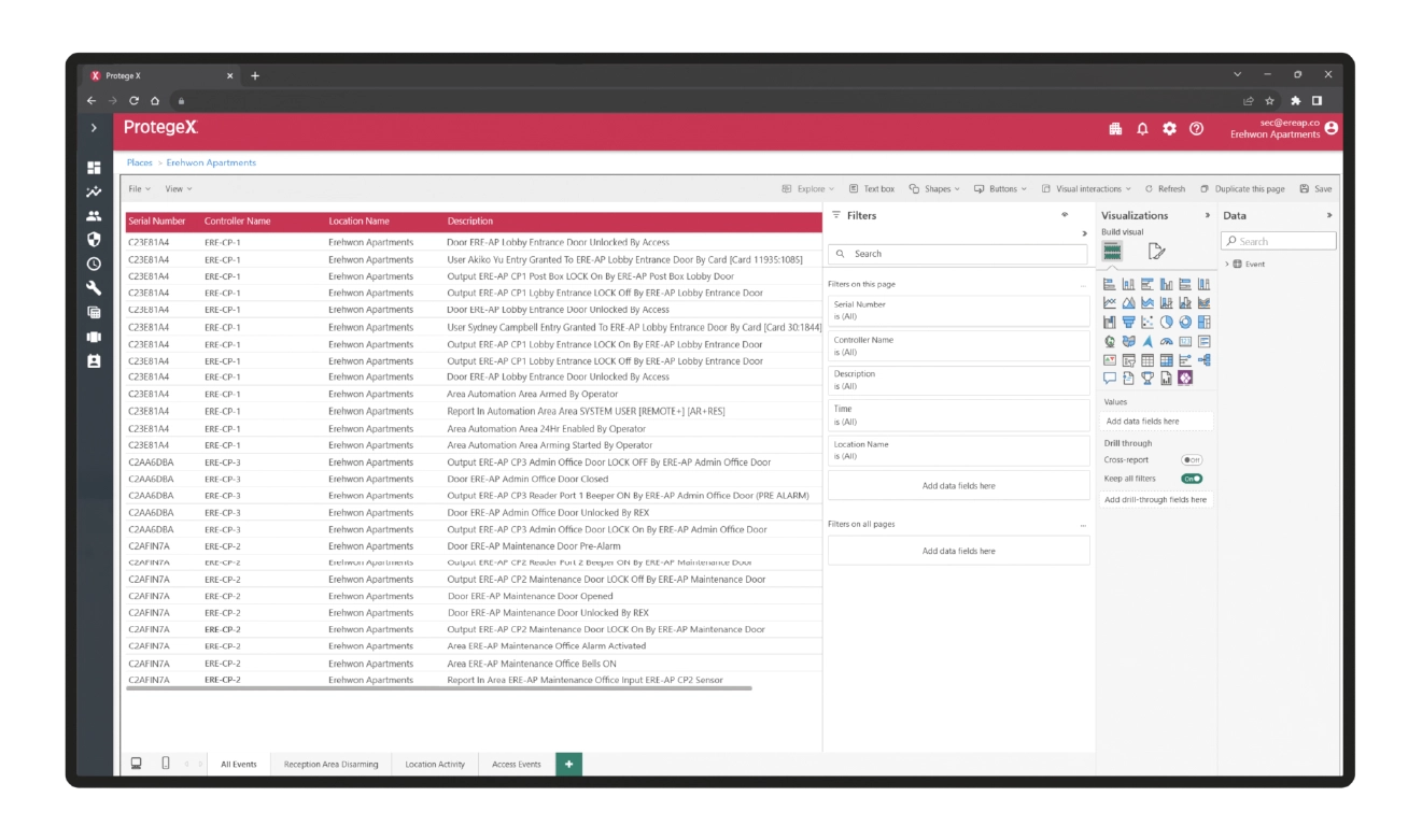
When you navigate within Protege X, you will see the Reports tab on the left side of the screen – this is where Power BI exists.
Filters and visuals
Any data in a Protege X event can be used to filter what information you see. For example, our default report has 5 built-in filters:
- Controller serial number
- Controller name
- Time
- Location name
- Event description
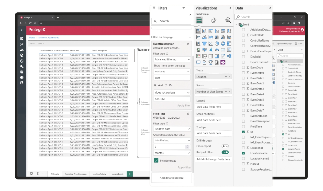
Filtering can be either basic or advanced. The advanced filtering enables you to use more complex search conditions, such as showing items that “contain” or “do not contain” certain words or phrases. Filters can also be used on their own or in conjunction with one another, so you can filter all events for a specific user during a certain time frame at a specific location.
Visuals are wide ranging and completely customizable to suit your needs – including the style of graph, as well as the colors and fonts used.
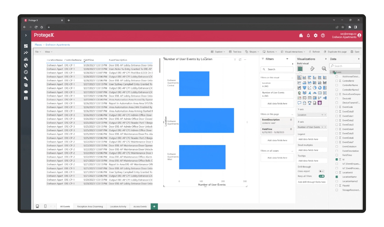
For example, let’s say you have a chain of fitness centers who use tSec readers and ICT Mobile Credentials, and you want to see which location has the most visitors every month without having to go and sift through the all the noise.
Using Power BI in Protege X, you can run a basic filter to narrow down the data to only the locations you’re interested in and create a bar graph with different colors for each location. Immediately you can see which locations are performing the best.
With advanced filtering, narrow this down further by excluding event descriptions that have “employee” in the name. Or use a line graph and only show when the centers are open to see at what times exactly each location is at its busiest.
This type of detail aids informed decision making for your business, creating a better experience for your staff and customers.
Getting help and exporting
Help documentation and programming walk-throughs for Power BI – and Protege X overall – can be found by clicking the question mark in the right corner of the screen.
All reports can be exported to standard CSV or Excel documents.
